Category: Corporate Identity

Saturnbienen

Kunde / Client: Independent Beekeeper, Vienna
Project: Logo & Label Design for a honey bottle

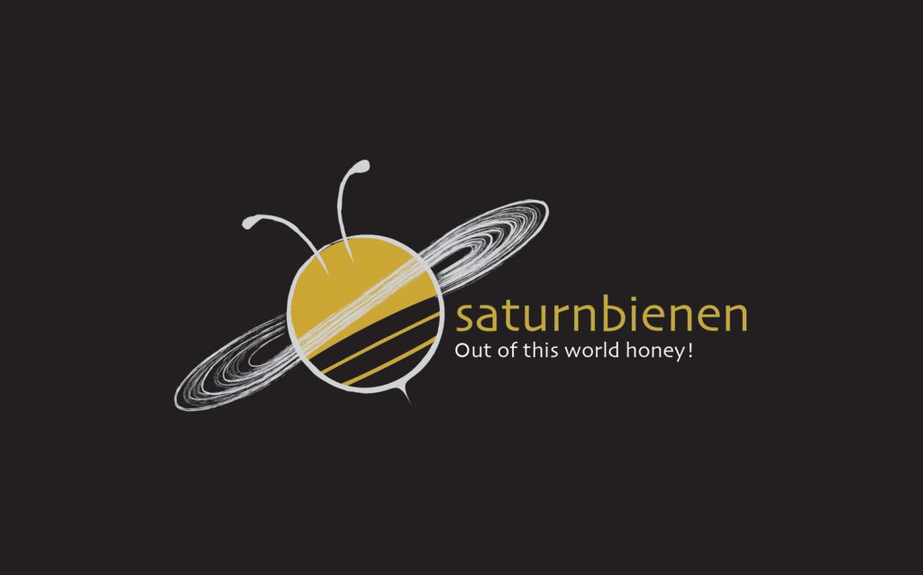
  • As the name suggests, the design for the logo was implemented to bring together the bee & the planet Saturn.
  • A bee flaps its wing approximately 230 times per second. The rings of Saturn are the most extensive ring system of any planet in the Solar System. A playful portrayal of wingbeat of the bee vs rings of Saturn was a nice opportunity to explore.
  • The Cassini Division is a region 4,800 km (3,000 mi) in width between Saturn’s A ring and B Ring. From Earth it appears as a thin black gap in the rings. This division is also represented in the logo.
  • Saturn’s axis is tilted by 26,73 degrees with respect to its orbit around the Sun. The Logo is also tilted at 26,73 degrees.

Together as One

Kunde / Client: Delegation of the European Union to the International Organisations in Vienna & Dominik Nostitz
Project: Concept & Social media graphic design for this diplomatic event

EUDEL Vienna Website: www.europa.eu/!yP89Ud

To celebrate European unity and solidarity in these unique times, a live stream performance of 9 Artists performing the 9th symphony of Beethoven on the 9th May for 9 Minutes has been scheduled.

The concept was to combine the various rainbow-drawings by children emerging in the world during this isolation/social-distancing-period with the stars in the European union Flag. Each star contribute a colour, and thereby growing (bigger) stronger with every colour and creating a rainbow  inspiring solidarity.

The Vienna Tapes – Limited Edition

Kunde / Client: Music Producer & DJ Dunkelbunt
Project: Cassette Tape Cover Design

Custom hand drawn illustrations for DJ, Music Producer Dunkelbunt for ‘The Vienna Tapes’ audio cassette limited edition release December 2019. As Dunkelbunt says,  ‘the Vienna Tapes, draws substantially from the pool of  international and globally active musicians in Vienna’ – The inspiration for the design was drawn as a map, referring to the cities where the artists & musicians who are part of ‘the Vienna Tapes’  originally come from – en route to Vienna.

The Vienna Tapes - Production

Schmuseum

Client: Welt Museum, Vienna
Idea & Concept: Dominik Nostitz
Project: Logo, Customised illustrations & Brochure Design  for 3 segment festival under the banner ‘Schmuseum’ at the Welt Museum over the course of 5 months.


Destillerie Farthofer

Client: Destillerie Farthofer,  www.destillerie-farthofer.at
With Veronika Egger,  is-design Gmbh
Project: Logo & Label Design

Destillerie Farthofer is an award winning family-owned distillery, est 1867, located in Öhling, Austria.  Inspired by the architectural stonework around their family house and  in appreciation of their tradition of  intricate distillation processes from their very own organically farmed lands, the swirl motifs were created.

Via Piranesi – Playing Card Deck

Client: Studio ViaPiranesi
Project: Corporate Design

Designed and created a unique, branded set of playing cards (56) for Via Piranesi, an architectural and exhibition design studio, keeping in mind the studio’s unique logo and font. The cards showcases the studio’s project portfolio in an elegant and interactive way on the back of the cards, for use as promotional tools for the company’s core client base.

Via Piranesi Playing card deck

Via Piranesi Playing card deck