Client: Verein Raga
Project: Concert Poster & Flyer Design
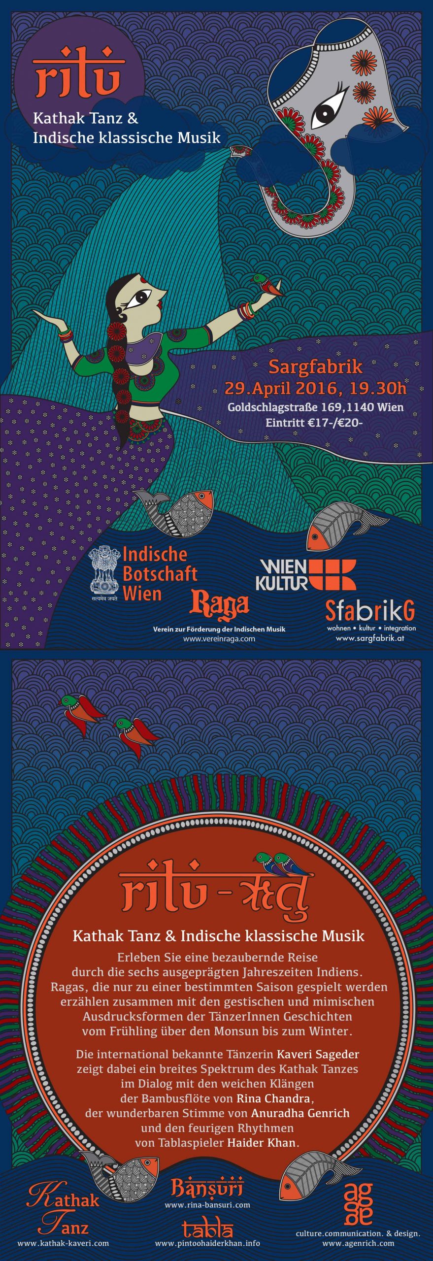
Client: Verein Raga
Project: Concert Poster & Flyer Design
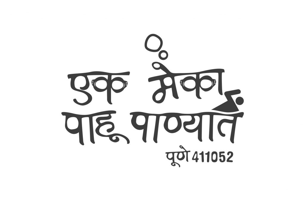
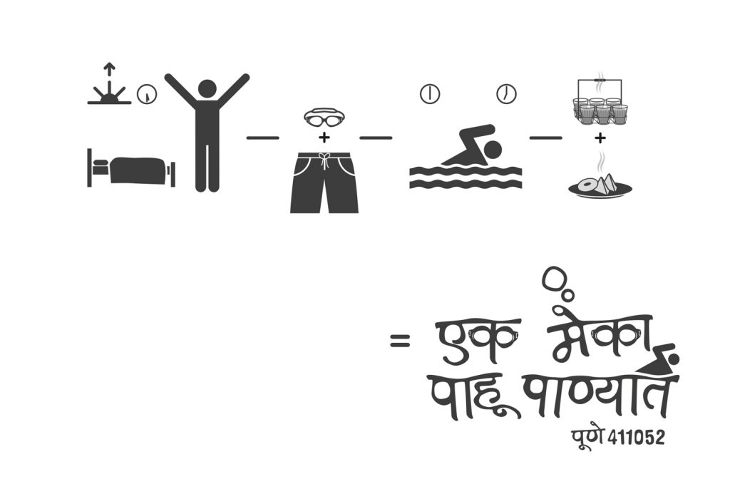
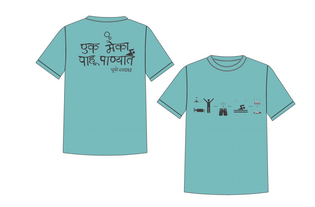
Kunde / Client: Individuals, Pune, India
Project: Customised Logo & T-Shirt Design for a Swimming club

Client: Wiener Linien
Project Supervision: Veronika Egger, is-design GmbH

A challenging project whose target was
– to illustrate the underground-station area with Wiener Linien’s facilities in correspondence to transportation connections on the street above-ground
– to achieve the seamless orientation for the commuters
The project was successfully completed and implemented at Karlsplatz, visible since 2014. Soon after, wegweiser for Hietzing, Praterstern and Hausfeldstrasse were also designed.
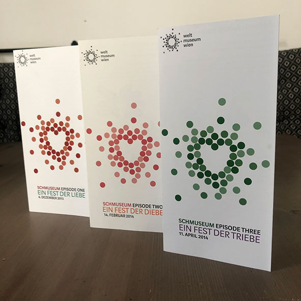
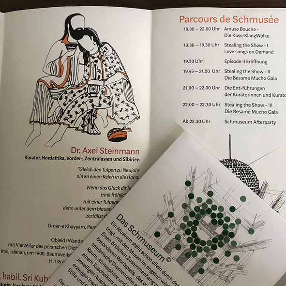
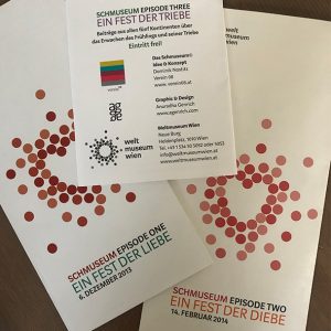
Client: Welt Museum, Vienna
Idea & Concept: Dominik Nostitz
Project: Logo, Customised illustrations & Brochure Design for 3 segment festival under the banner ‘Schmuseum’ at the Welt Museum over the course of 5 months.


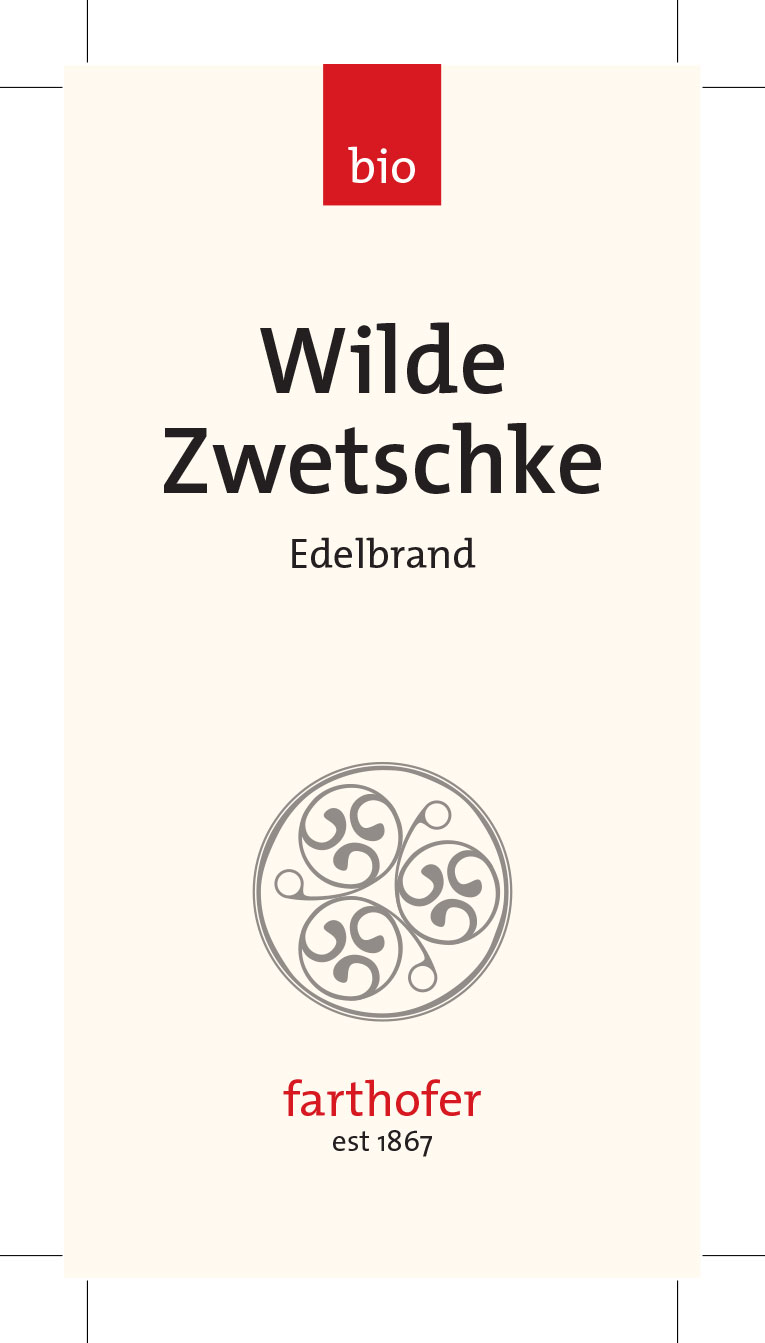
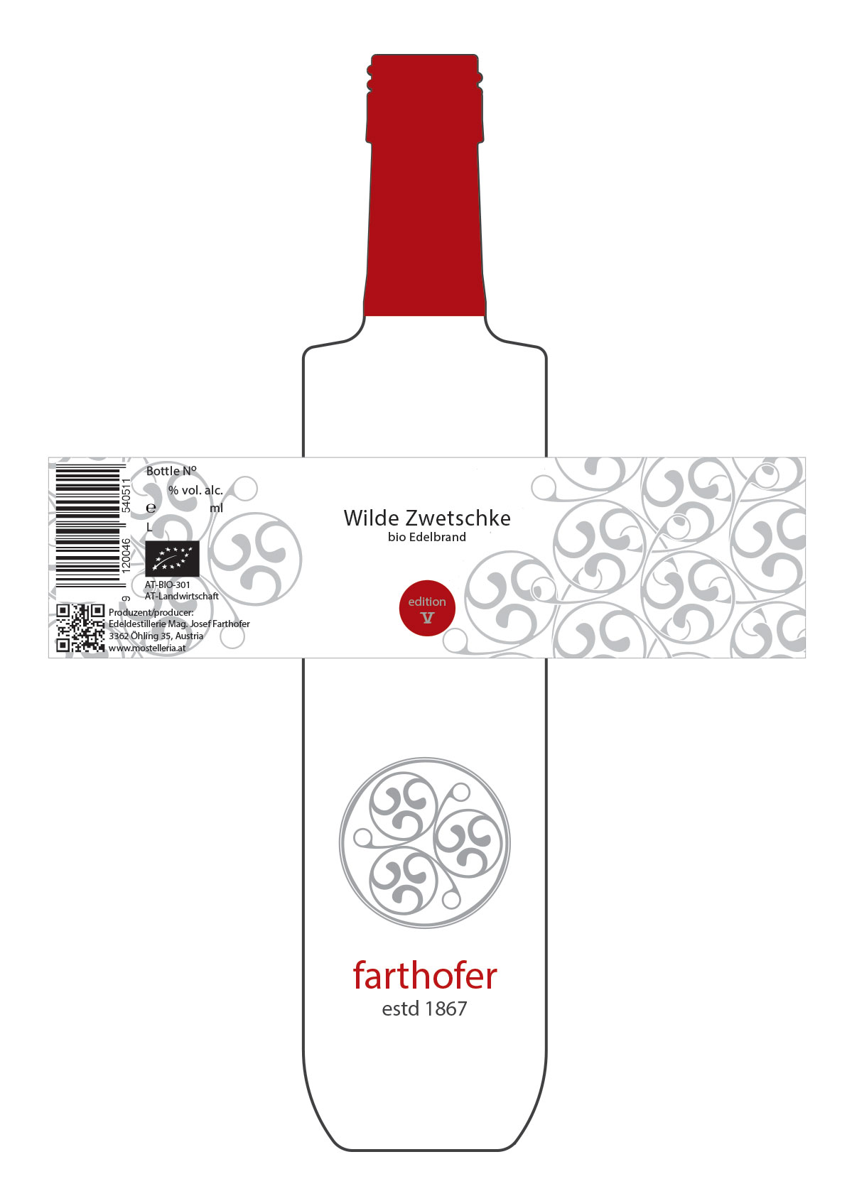
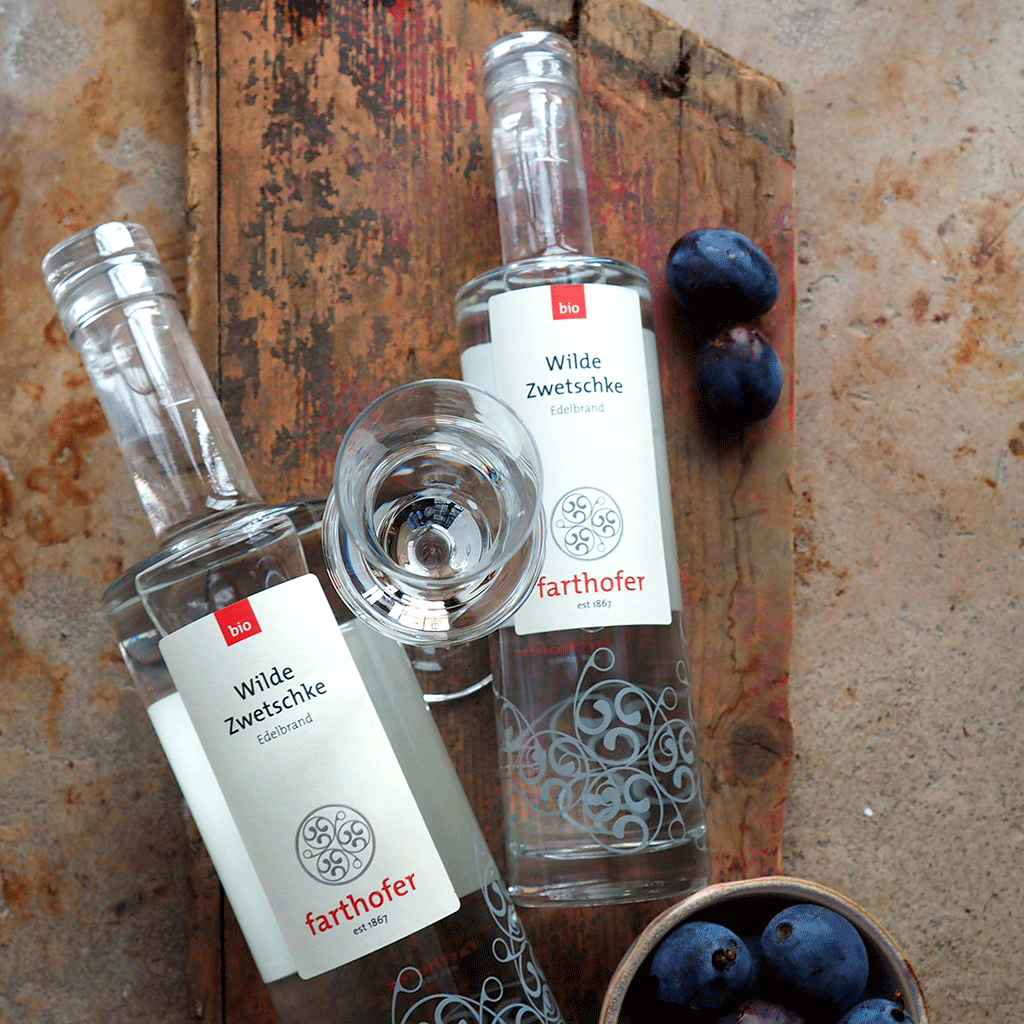
Client: Destillerie Farthofer, www.destillerie-farthofer.at
With Veronika Egger, is-design Gmbh
Project: Logo & Label Design
Destillerie Farthofer is an award winning family-owned distillery, est 1867, located in Öhling, Austria. Inspired by the architectural stonework around their family house and in appreciation of their tradition of intricate distillation processes from their very own organically farmed lands, the swirl motifs were created.
![]()
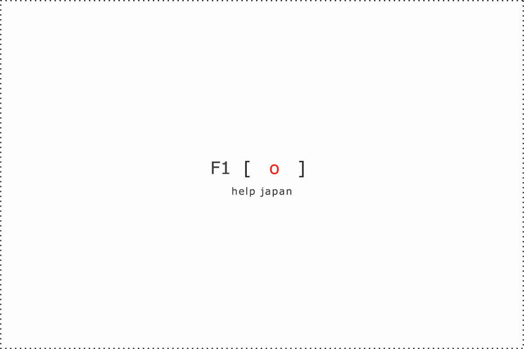
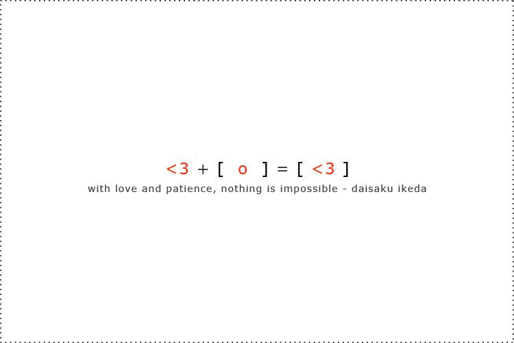
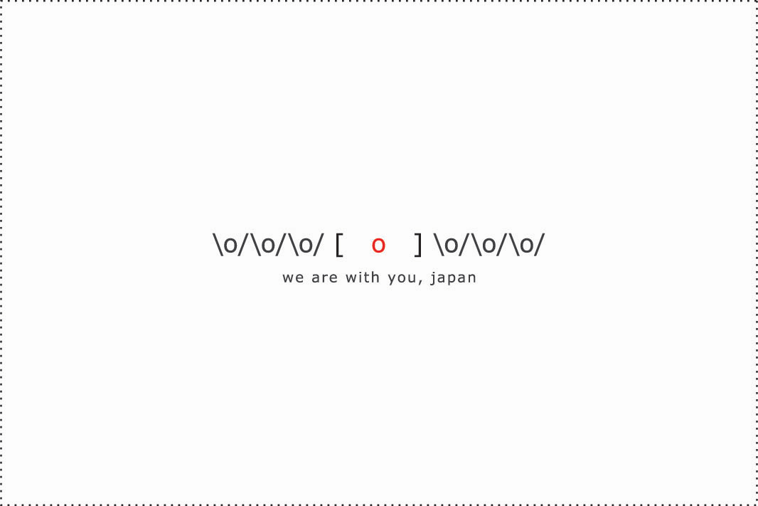
‘F1 [ o ]’ is a series of greeting cards, I designed based on my current research communication design thesis, for a competition by Design21(UNESCO) expressing the sentiment of “I’m with you!” during the 2011 Fukushima Daiichi nuclear disaster in Japan.
Today’s generation are breaking down traditional communication methods and are finding ways to cut short the components of vocabulary. And it is those elements that form a common language thread to communicate my message in the greeting cards. And the icons and symbols form a universal tool overcoming challenges posed by language and provide communication tools to be globally understood. These icons and symbols in the greeting cards are also user friendly: They could be typed as a status message, transferred / printed on any accessory.

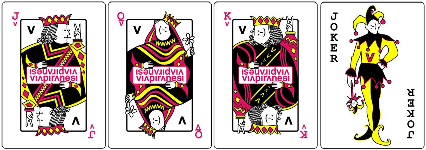
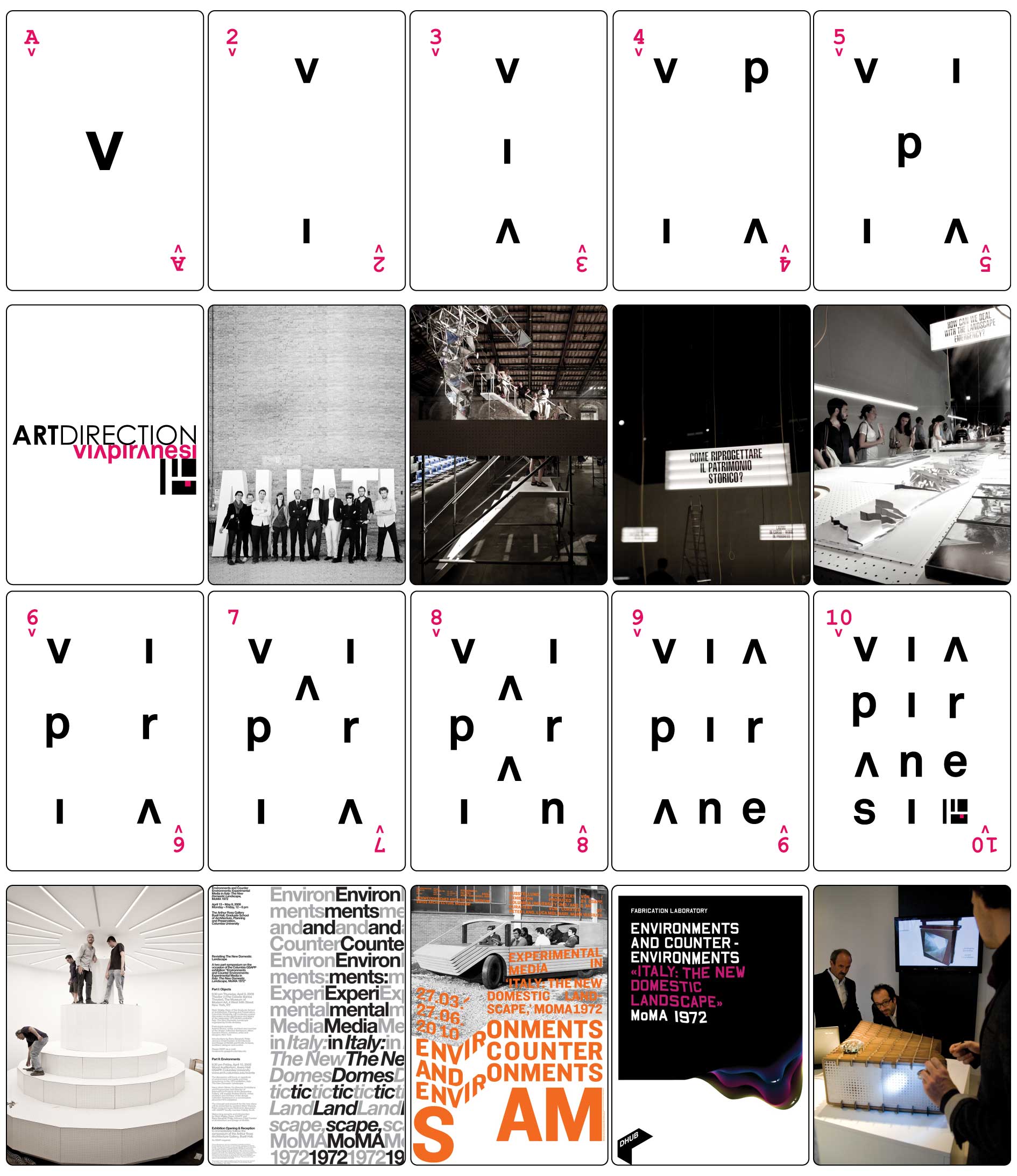
Client: Studio ViaPiranesi
Project: Corporate Design
Designed and created a unique, branded set of playing cards (56) for Via Piranesi, an architectural and exhibition design studio, keeping in mind the studio’s unique logo and font. The cards showcases the studio’s project portfolio in an elegant and interactive way on the back of the cards, for use as promotional tools for the company’s core client base.
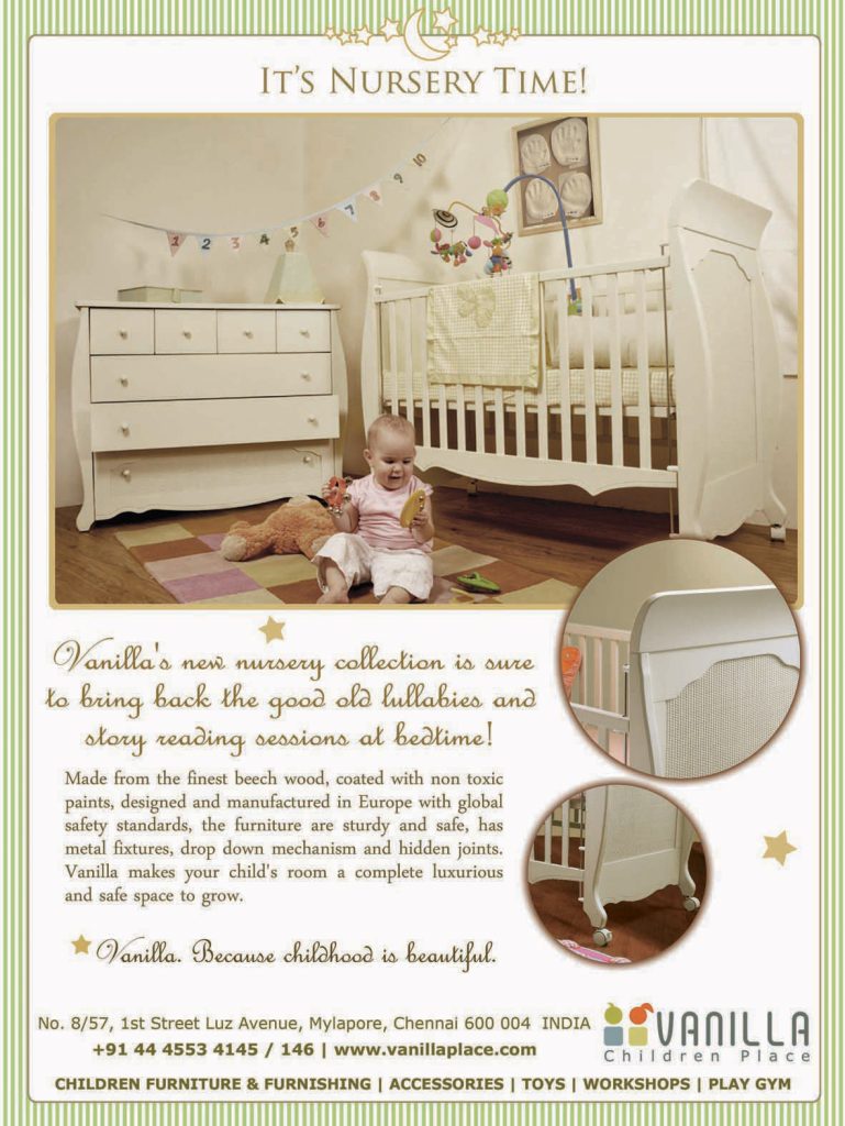
Kunde / Client: Vanilla Children’s Place
Project: Advertisement for a Children’s Magazine
Vanilla Children’s Place is an all-in-one centre catering to the needs of parents, parents-to-be, babies, toddlers and children, offering a calm yet vibrant environment to play, learn, relax and shop for the mother and child. Vanilla also designed and sold customised furniture, one of its kind in Chennai, India in 2008, and this was one of the full page advert I designed for them.
Vanilla was my client from 2008-2009 and my work included designing print ads, regular monthly event posters & flyers, newsletters, emailers, invitations and table-tops for their cafe, coupons for their toddler/mommy-baby classes etc.